The bond market keeps signaling an economic recession in the U.S. The inversion of the yield curve is now at its steepest point since the bear market began. Chart 1 shows the spread between the 2-year (red dotted line) and the 10-year (solid line) Treasury Yield at a whopping -0.81bps (lower window). If I go by historic readings of inverted yield curves, one may conclude that bond investors may be anticipating that the mother of all bubbles is about to burst or the economy is going into a deep recession. Whether or not it is correct, remains to be seen, but it would be a failure on my part as a risk manager not to acknowledge such inversion and its possible consequences over the portfolios I manage.
Chart 1
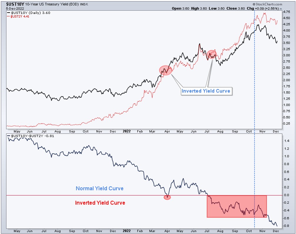
In my opinion, the rally in stocks on Wednesday 30 was an overreaction to the Fed’s “fake pivot.” The bottom line is that it was just an announcement that they would slow the pace of rate hikes from 75bps to 50bps, which the market already knew. The Fed said they would hike rates at a slower pace; in response, the market’s Fed Funds rate expectations increased while the 5- to 10-year part of the yield curve rallied in price (lowering yields) resulting in the sharply inverted yield curve mentioned above. The spread between the 1-year and 10-year yield is now -0.90bps. How is this good for the economy and stocks?
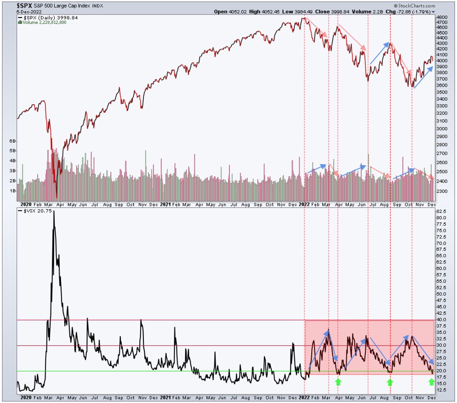
At the time the bond market continues raising a red flag, the S&P 500 and the Nasdaq 100 remain on bear market rallies, where defensive sectors and seasonality are either leading or helping the indices to hold up. Money continues to rotate out of technology and economically-sensitive consumer discretionary stocks and into more defensive sectors like health care, consumer staples, and utilities. On the second tier of interest by investors, we’ve noticed positive flows of money into industrial, financials, energy, and materials. Seasonality has helped the S&P 500 during the last 20 years: November (+1.8%) and December (+1.2%) 75% and 70% of the time respectively.
Our Greenwich Creek Capital quantitative analysis continues to point to a short-term uptrend for stocks within a bigger bear market trend. The S&P 500 Index is overbought and trading at the top of its resistance area, while volatility ($VIX) is oversold and trading at the bottom of its support area. Chart 2, shows 3 green arrows on the bottom window. Usually, this is where volatility spikes and stocks fall. Needless to say, this is exactly where the S&P 500 and $VIX are now. The top window of the chart shows the S&P 500 Index moving up on lower volume, and moving down on increasing volume. Notice that every time the volatility index ($VIX) moves up from 19-20 to 30-33 the S&P 500 falls and every time $VIX falls back to its lower range (19-20) the S&P 500 moves up. And this is how a bear market rally behaves. The question is until when? The answer is until it stops behaving like that.
As a reminder:
S&P 500 moving up on increasing volume and lower volatility = BULL MARKET
S&P 500 moving down on increasing volume and higher volatility = BEAR MARKET
S&P 500 moving up on lower volume and unchanged volatility = BEAR MARKET RALLY
Chart 2
Maybe this is the beginning of the end of the bear market and a new bull market is arising. If it is, I will change my stance to capital at risk. Since the fake pivot on Wednesday, nothing has changed for the better, on the contrary, the global economy continues to weaken alongside decelerating inflation. Remember that in Phase 4 of the economic cycle, both GDP and inflation decelerate together and the sharp inversion of the yield curve anticipates an economic recession, which in my opinion is not priced in the stock market yet. On the contrary, stock investors seem to believe that the pausing of interest rate hikes will help the economy avoid the recession signaled by bond investors.
On the long side, our quantitative analysis is pointing our attention to consumer staples, health care, energy (ex-oil), gold, silver, and an oversold US Dollar. On the short side, to technology, growth, and high beta stocks. This combination is hardly supportive or evidence of a new bull market in the making.
Chart 3 shows the S&P 500 Index reaching resistance (3 green boxes) right above the 200-Day MA in April, then in mid-August peaking at the same 200-Day MA, and now just above the 200-Day MA. The attempts to break above the resistance area failed twice, in April and August. The components of both bear market rallies, March-April and July-August were very similar to the components of the current rally in stocks that started in mid-October.
Chart 3
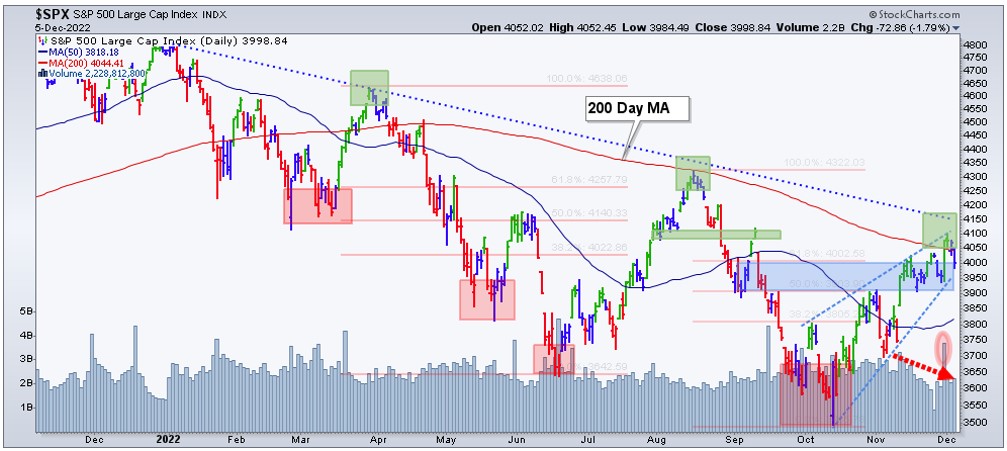
The red dotted arrow on chart 3 shows a lower volume trend during the November rally. The tall bar on the right (pink shaded oval) shows the spike in volume originated from the FED’s fake pivot announcement on Wednesday 30.
Conclusion: Our quantitative process indicates that we should remain defensive and the Main Trend of the S&P 500 Index (SPX) is still bearish. I’m open to the idea that this move up might end up being the beginning of a new leg up (so far a bear market rally) and eventually the resumption of the Bull Market. Some of the short-term indicators are now bullish due to the rally experienced from mid-October to last Friday, but for a bear market rally to become the beginning of a new bull market, the mid-term indicators have to change from bearish to bullish. We are not there yet.
To understand financial market trends, markets must be analyzed in different durations: Short-term, mid-term, and long-term. The quantitative analysis of those trends allows for the proper understanding of the Main Trend of financial markets. The Main Trend is the bigger and predominant trend, which is still bearish for the S&P 500, Nasdaq Composite, and Nasdaq 100. Without understanding market behavior in different time frames or durations, it is impossible to know if a bear market rally is an opportunity to lighten up on risk, or if it is the beginning of a new up-trend.
Check the Main Trend of stock indices, volatility, yield, currencies, and much more here.
Consider not being fully invested, taking on smaller position sizes, and holding a higher allocation of cash.
(*) The Greenwich Creek Capital “Index Trend Table” is not meant to be used in isolation, it is part of a more complex set of variables and it is not designed to provide trade entry and exit points.
Do you have a risk management strategy and a proven repetitive investment process to profit in bull markets and protect capital in bear markets? Check our website for more information about how we manage investment portfolios:
www.GreenwichCreekCapital.com
For High Net Worth Portfolios
And
www.FreedomInvest.com
The Active Asset Management Platform for Small Accounts.